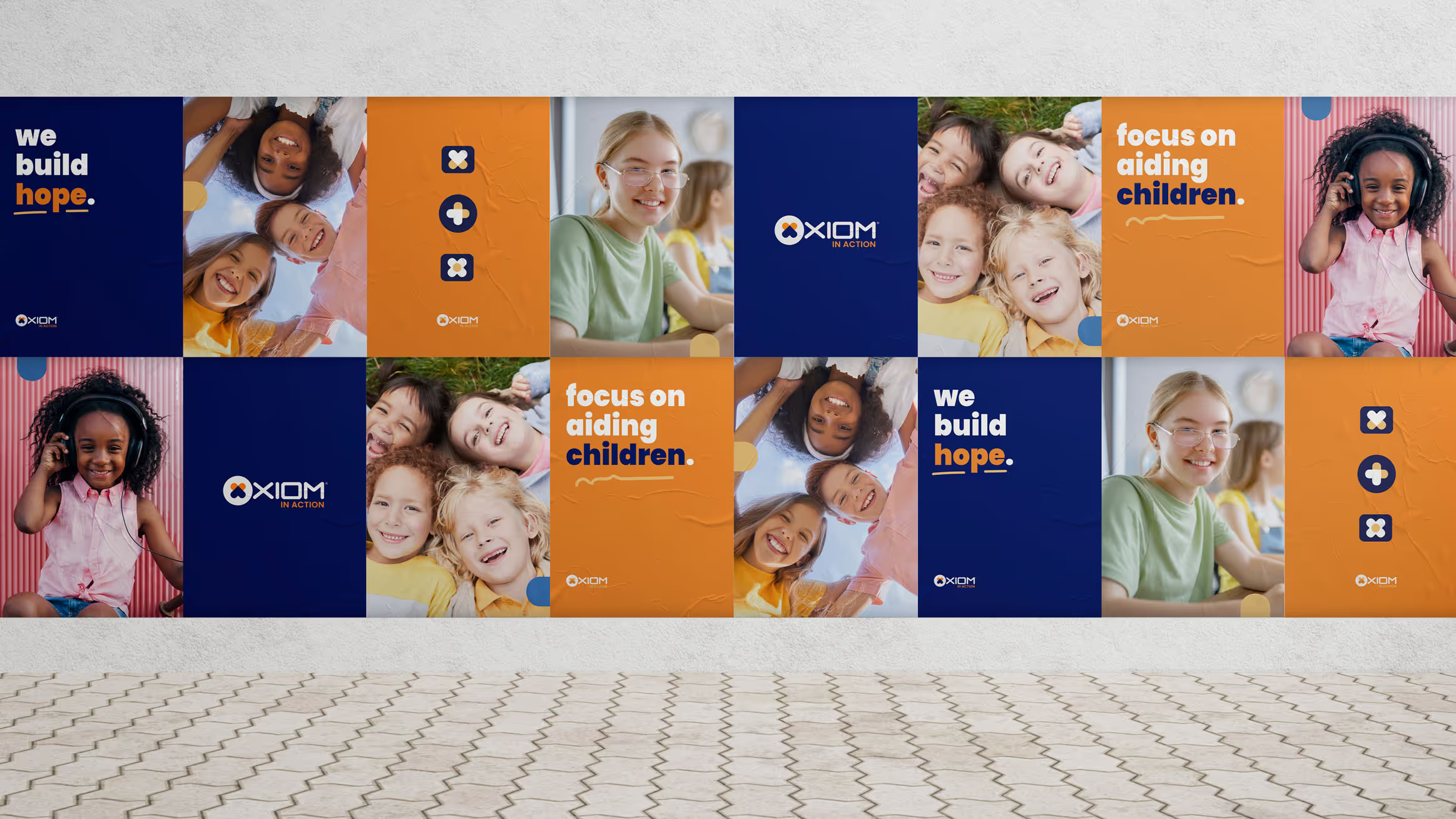
A brand identity for the charitable programme of a US warranty technology company — related to the parent company at a glance, unmistakably its own voice, and documented so partner organisations can run it themselves.
Axiom had supported community causes for years, the way most companies do: an event here, a donation there, materials made the week before by whoever was closest to the deadline.
As the programme became structured and continuous, it outgrew that. It needed an identity of its own — visibly part of Axiom, so the commitment is credited to the company, and visibly its own thing, so it reads as genuine rather than promotional. Corporate giving that looks like marketing undermines what it is trying to do.
The practical constraint mattered as much as the strategic one. Most material on the ground is produced by partner organisations and volunteers rather than designers, usually a few days before an event.
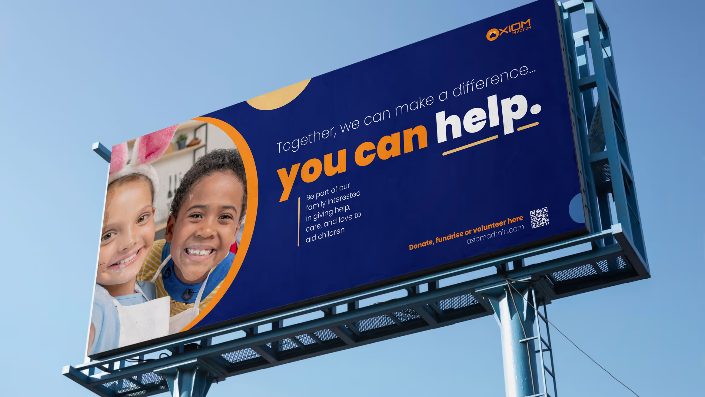
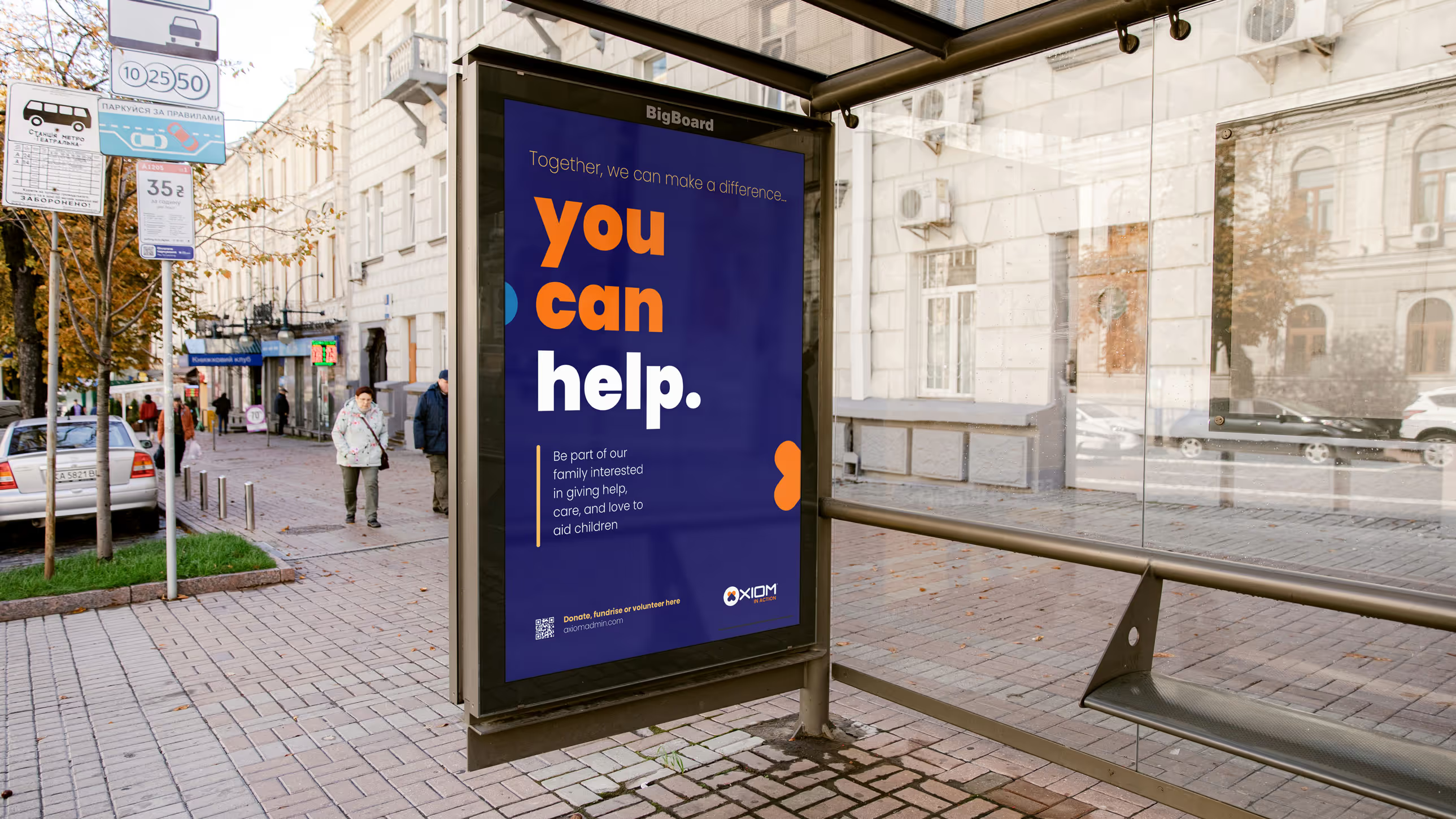
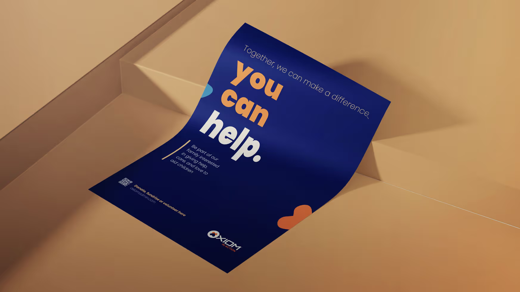
a mark that belongs to the parent, and a tone that belongs to the programme.
The emblem — a flower, a heart and a cross resolved into one circular mark — takes the place of the initial in the Axiom wordmark, so the relationship is legible before anyone reads a word. Everything around it belongs to the programme: real photography of the people it supports, warmer colour, and language that asks rather than sells.
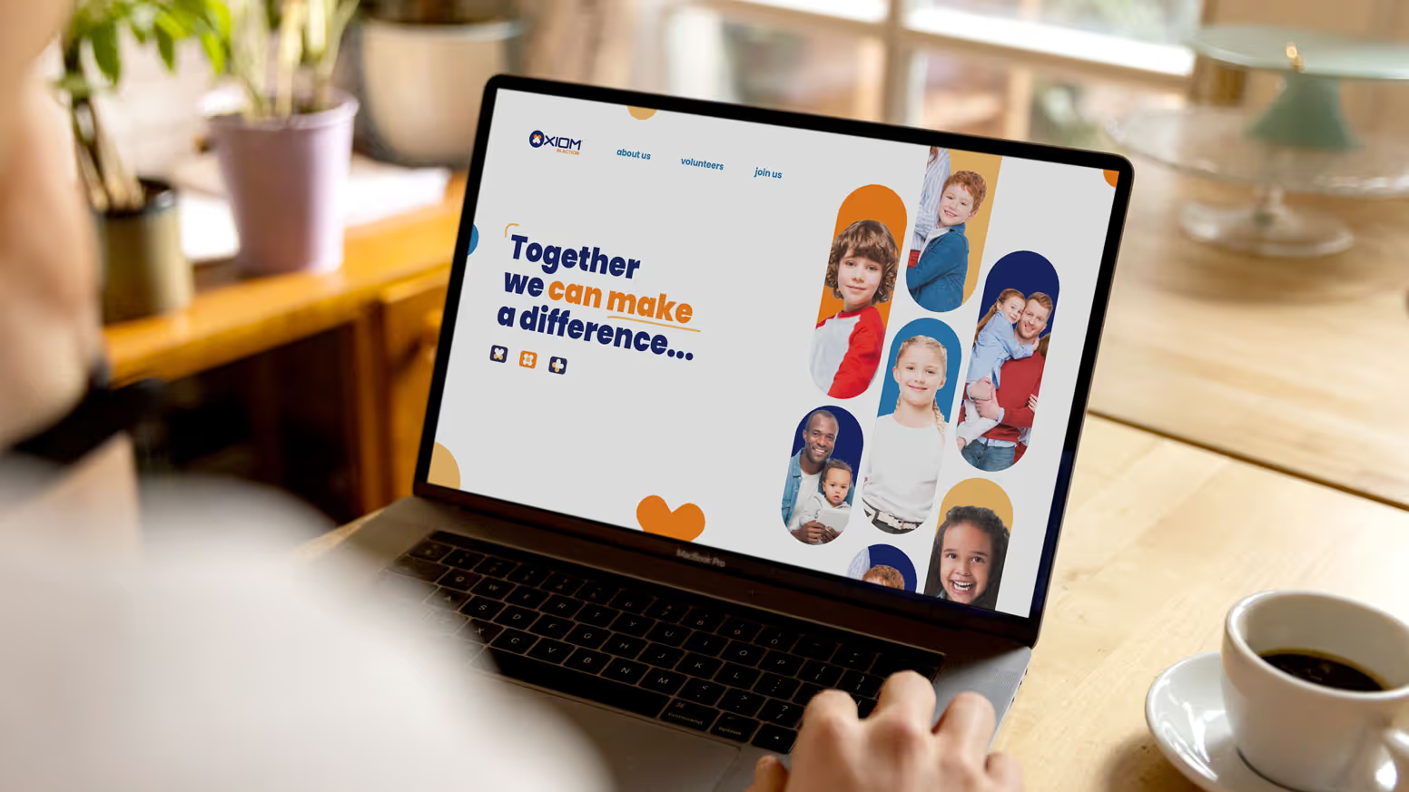
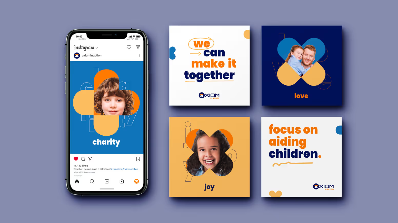
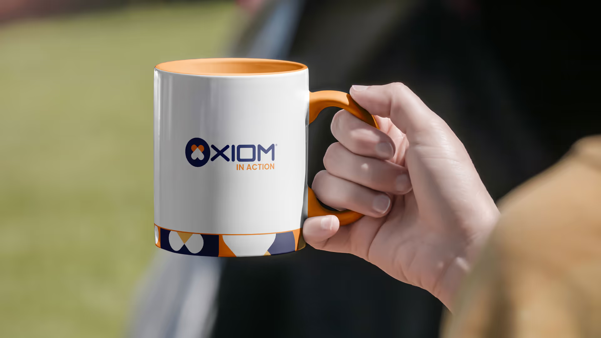
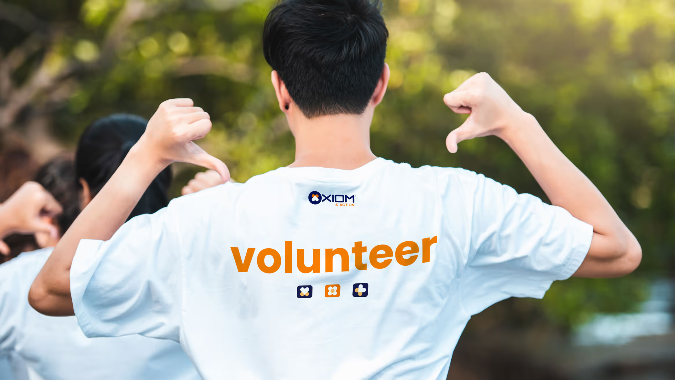
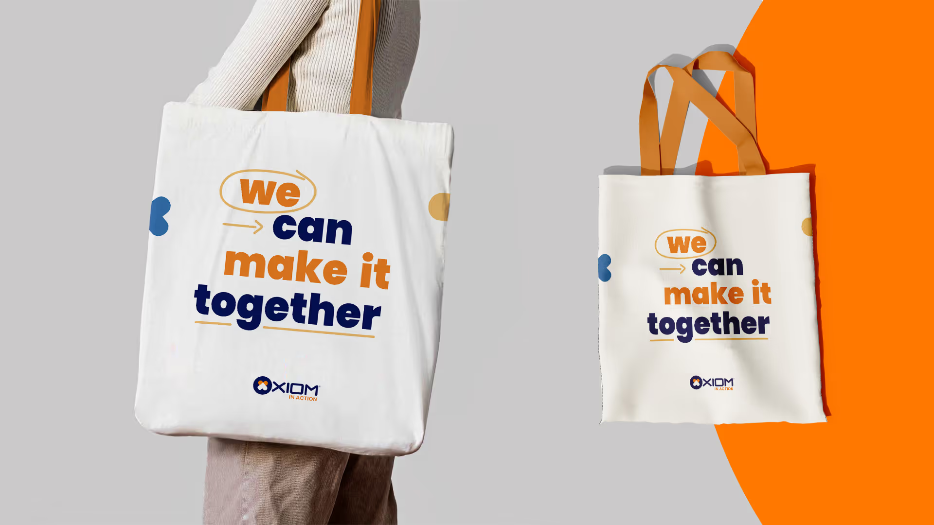
The emblem carries the whole system. It holds at billboard size, survives being stitched onto a tote bag and still reads as a badge on a volunteer's shirt — which between them covers most of what a community programme actually has to produce.
Because the guidelines were written for people outside the company, material made by a partner looks like material made in-house. That reliability is the difference between a programme and a series of separate events.
Axiom in Action is now presented the same way at every event, by every partner, regardless of whether anyone from the company is in the room.
A new campaign starts from a system instead of from scratch — and the programme reads as a long-term commitment rather than a sequence of one-off gestures, which is what it is.