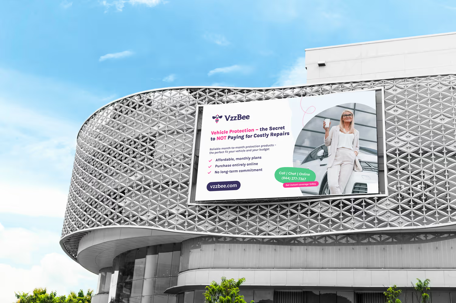
A campaign system for a US subscription insurance brand — one idea that holds from a phone screen to the side of a bus, with each medium designed on its own terms so new formats can be added later from the same system.
VzzBee sells protection for the things people already own — car, home, devices — as a monthly subscription you can cancel whenever you like. That is a genuinely better deal than the category norm, and also the hardest kind of claim to make, because everyone in insurance says something adjacent.
The real job was to make the product feel like what it is: easy, cheerful and free of the small print people brace for. That feeling has to survive being cut to six words on a billboard, and survive being expanded into a page of detail online.
The brand also had to appear in very different places on very different budgets — paid social, printed flyers, bus wraps, building signage, the product pages. So the system had to be designed for each medium, from the ground up.

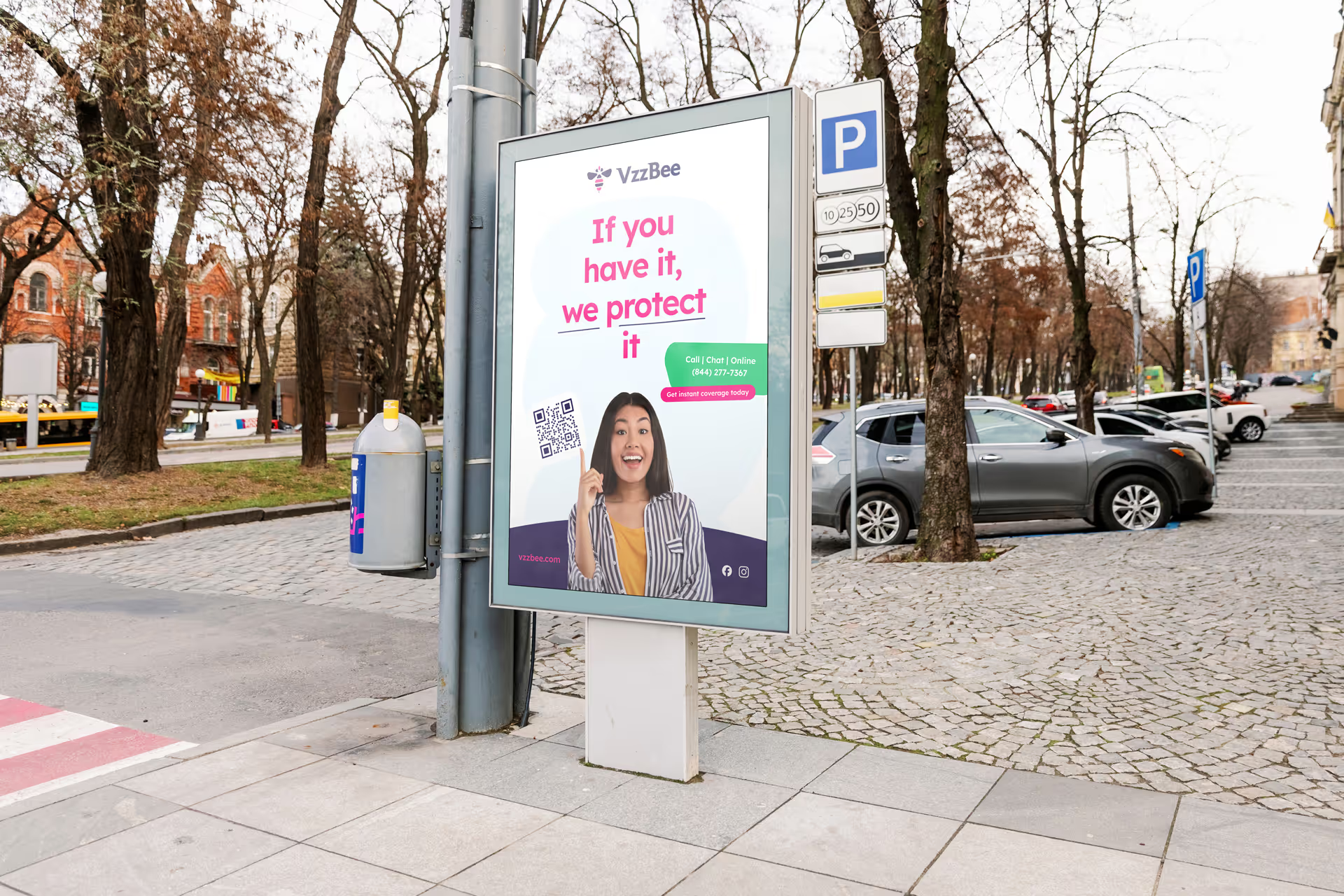
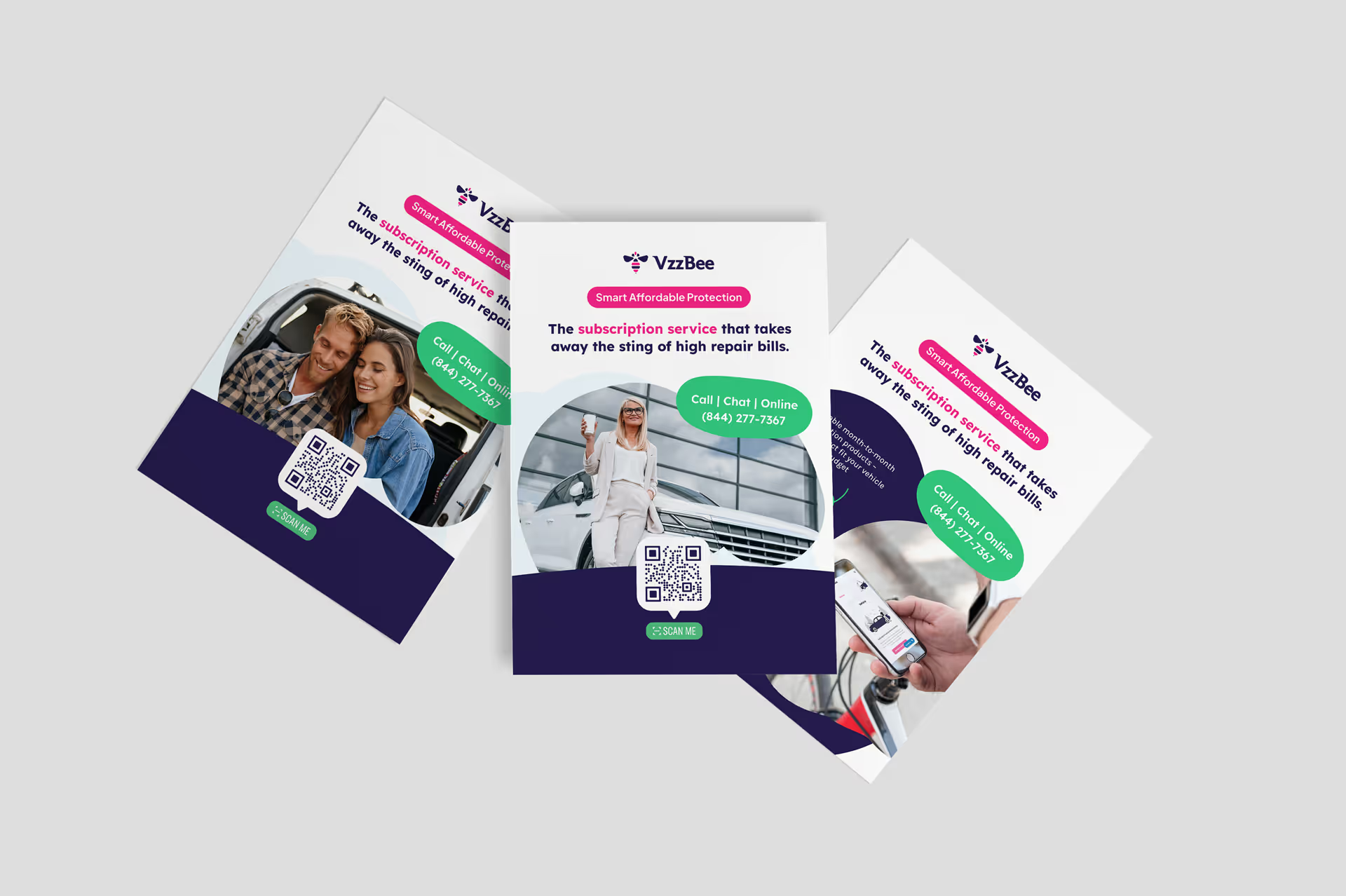
one message, phone screen to billboard.
A single cheerful visual idea, tuned per medium rather than repeated. On screen the palette stays soft and bright and the copy can carry detail. In print and at large format the artwork was drawn for the press and the viewing distance from the start — stronger contrast, fewer words, readable from a moving car — so the run looks deliberate instead of resized.
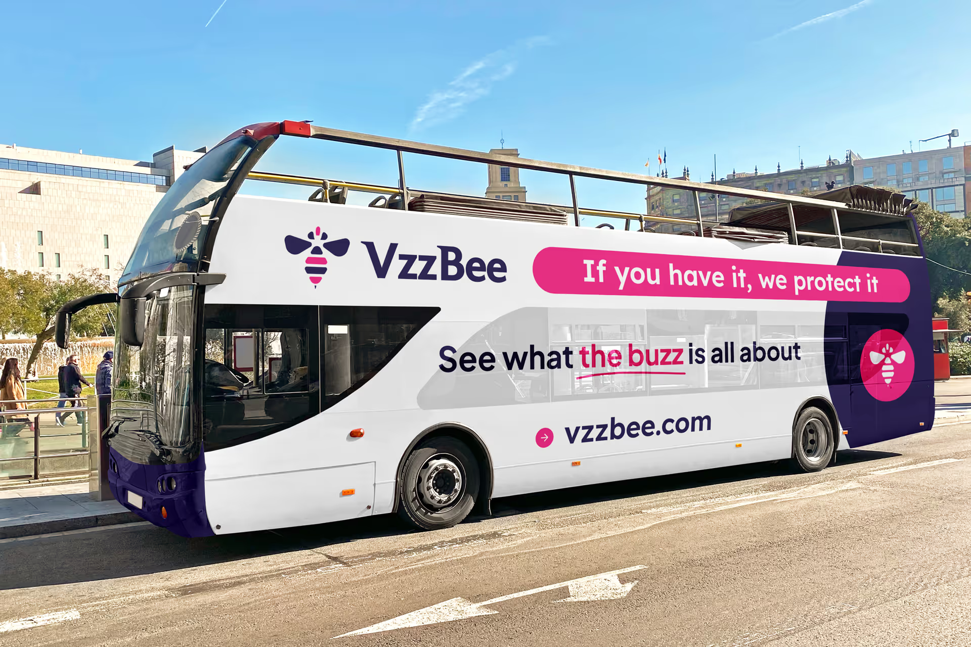
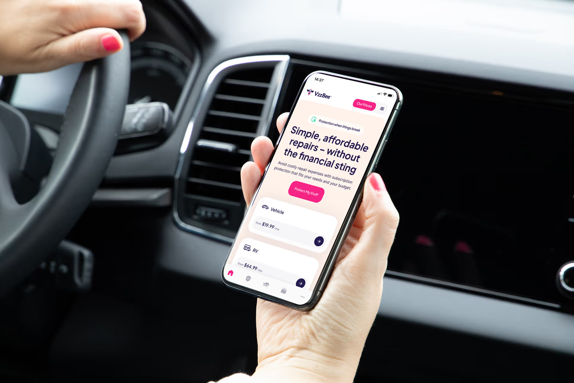
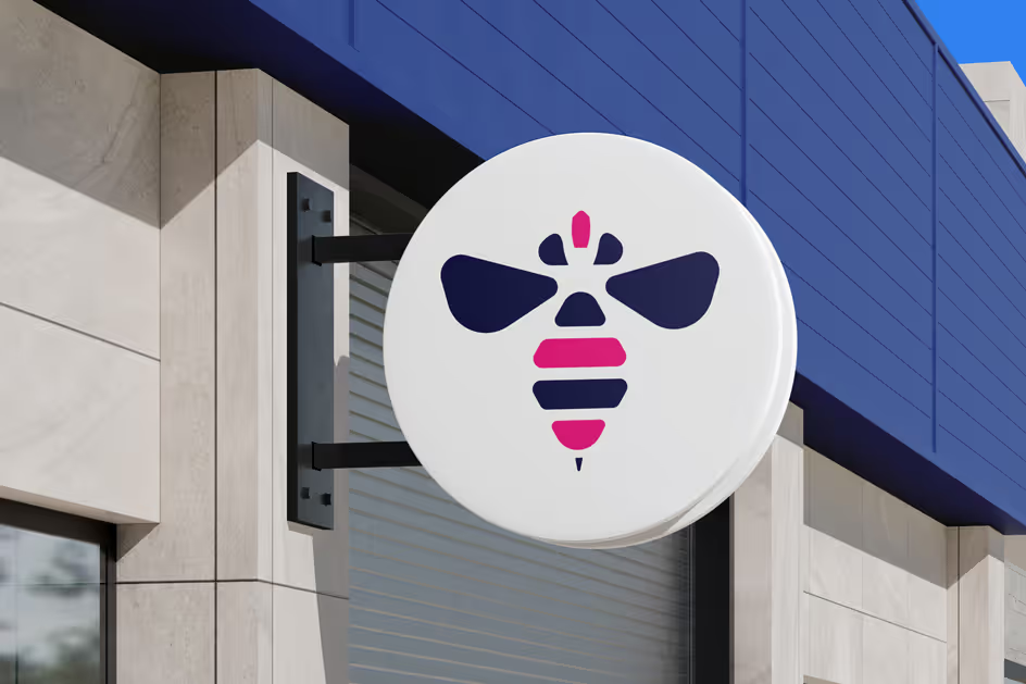
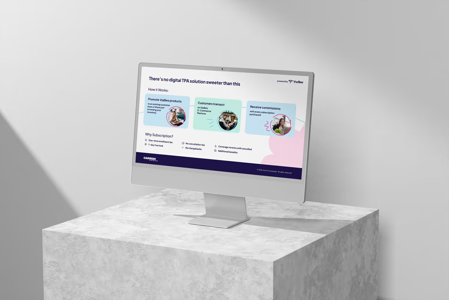
The same campaign ran across paid social, printed material, digital out-of-home, a full bus wrap, building signage and the product pages — and stayed recognisably itself at every size.
Consistency at that spread is what makes a young brand look established. In a category where the competition is large and long-standing, being visibly coherent is a substantial part of being credible.
VzzBee went from a product that had to be explained to a brand that could be recognised — the point at which marketing spend starts compounding instead of restarting.
The system outlived the campaign: new formats were added later, straight from the same components.