Veer Dealer Services

About This Project
Veer Dealer Services operates within the American automotive dealership ecosystem. The goal was to design a visual identity that felt authentic to the automotive industry while communicating reliability, professionalism, and financial trust — an identity that exists at the intersection of motion and control.
01
Automotive dealer services companies work closely with car dealerships, providing extended warranties, service contracts, insurance products, and financial solutions. Their audience is both B2B and consumer-facing: dealership partners, financial institutions, and ultimately drivers themselves.
Branding in this space tends toward two extremes — aggressive automotive speed cues, or conservative financial branding closer to banking. For Veer, neither direction felt right. The identity needed to balance motion and control, speed and stability, technology and trust.
02 — Design Philosophy
Typographic Wordmark
Strong sans-serif with a subtle forward lean — automotive momentum without aggression.
Dynamic Curve
A controlled directional shift — the S-curve represents the moment a driver adjusts trajectory while maintaining precision control.
Blue Gradient System
Light traveling along a curved surface — depth, trust, and modern technology connecting automotive blue to financial confidence.
03
The wordmark uses a strong sans-serif structure with a subtle forward lean, creating a natural sense of momentum without appearing overly aggressive. The slightly italicized orientation reflects forward movement, echoing the sensation of a vehicle in motion.
At the same time, the letterforms remain wide and balanced — preventing the logo from feeling unstable. This structural stability was important because the brand represents financial protection and insurance products, where visual reliability matters.
04
The defining visual element is the dynamic curve placed above the logotype — designed to represent the moment of directional change, the point at which a driver adjusts trajectory while maintaining control.
The geometry was carefully developed to mimic the rhythm of a controlled driving maneuver. The line enters the composition as a thin trajectory, gradually rises toward an apex, then tapers again as it exits — creating a visual sense of tension and release.
05
Blue was chosen for its strong associations with trust, reliability, and technology — particularly relevant for insurance and financial services. The cooler automotive blue tones connect the identity to the visual language of modern vehicle design.
The gradient from light to deep creates the impression of light traveling along a curved surface, similar to reflections moving across the body of a car — adding depth and motion without turning the line into a literal illustration.
06
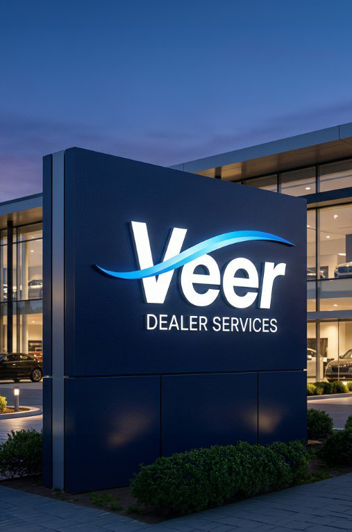
The simplicity of the mark allows it to scale across a wide range of real-world contexts — illuminated exterior signage on dealership buildings, embossed on insurance folders, or integrated into digital interfaces.
The curve creates opportunities for motion design in digital contexts. The trajectory line can animate across the screen to introduce the logo or guide transitions between content sections.
Brand applications: signage, print, digital
Logo Versions
Background
#00263F
Wordmark
#FFFFFF
Line
#009DEA
Background
#FFFFFF
Wordmark
#00263F
Line
#009DEA
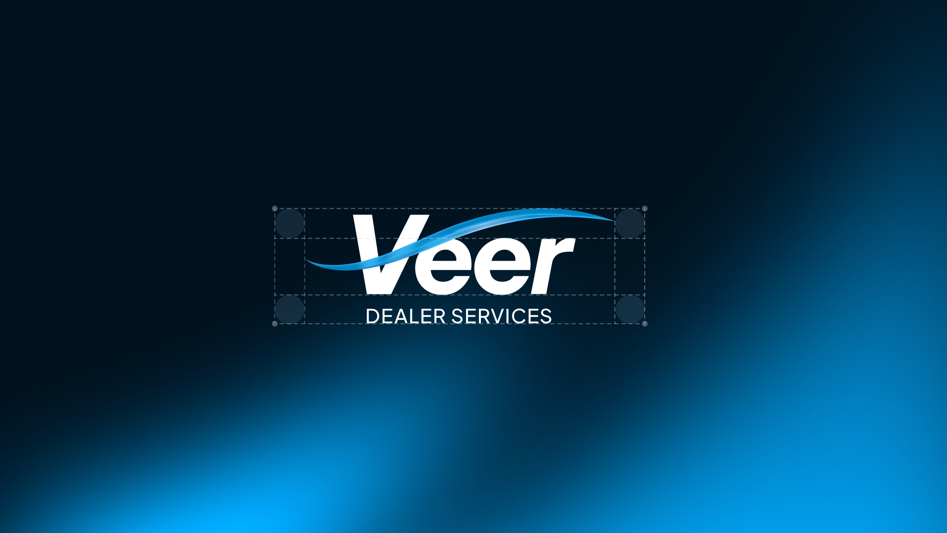
Safe Zone
Maintain minimum clear space equal to the cap height of the “V” letterform on all four sides. No graphic elements may intrude within this protected zone.