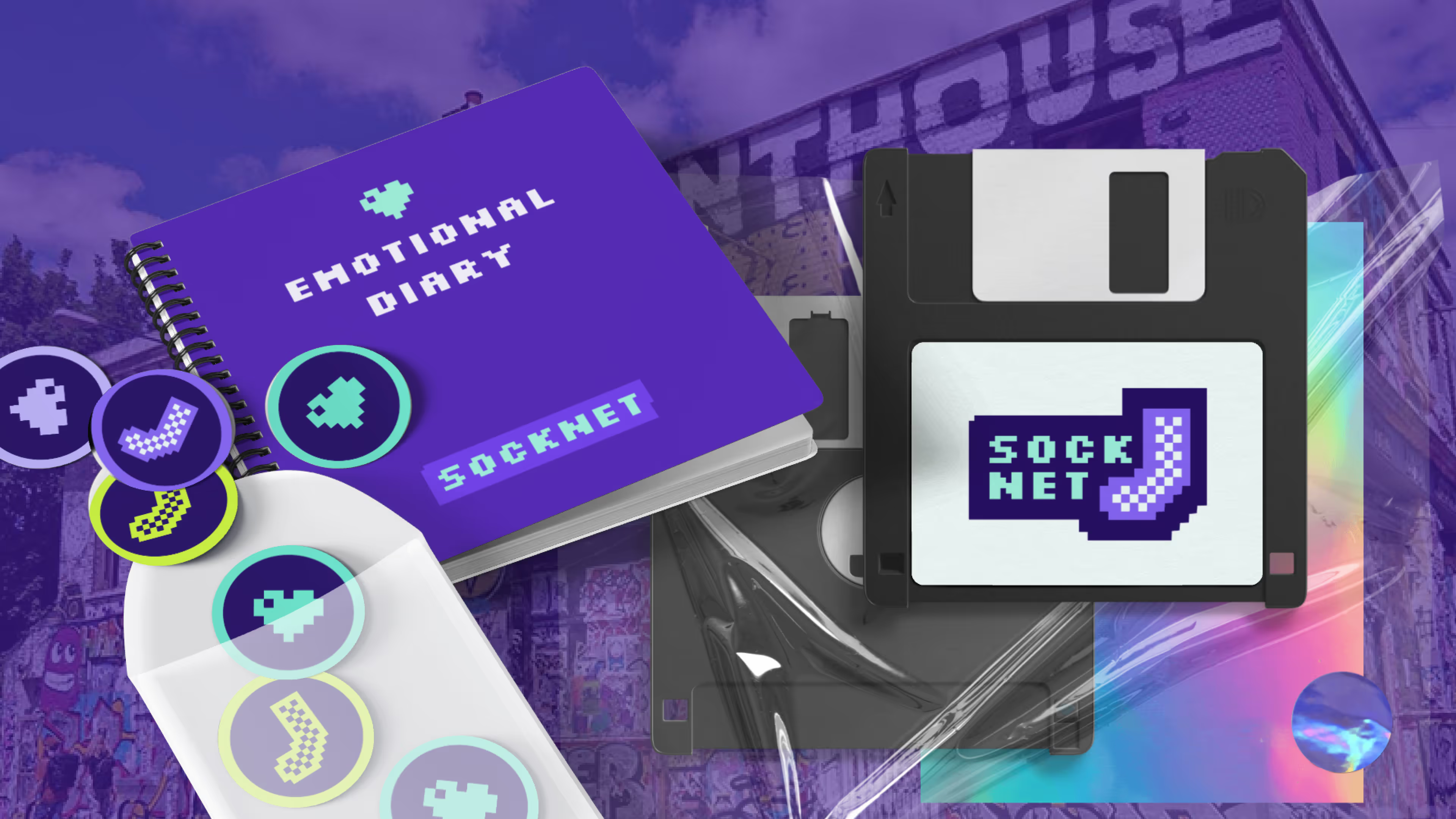
A full visual identity for a London social app built for introverts and makers — pixel art, early-internet warmth, and a system that runs from an app screen to an NFC sock, a sticker in a café and a party invitation.
SockNet is a social space for introverts, creators and people tired of swiping through faces like a clearance sale — a small London startup with a gentle argument against loneliness and cynicism.
A brand like that has to feel like a place first and software second. It has to be recognisable on a wall, on a sock and on a screen, because that is genuinely where it lives: the product is discovered in the physical world and continues in the app.
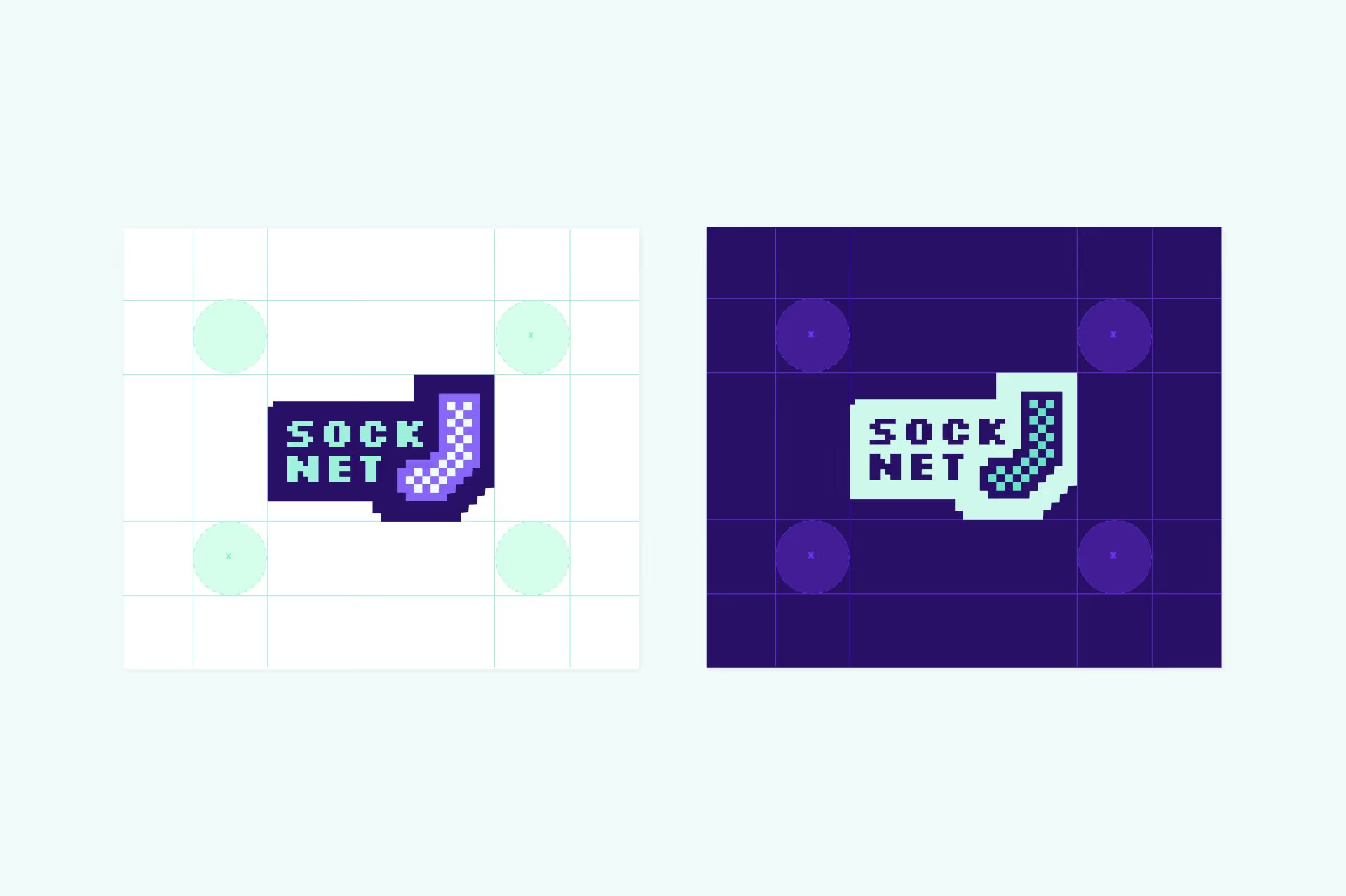
So the identity had to be warm rather than slick, unmistakable at very small sizes, and systematic enough that a tiny team could keep producing new material on their own, sticker by sticker.

digital that remembers it used to be personal.
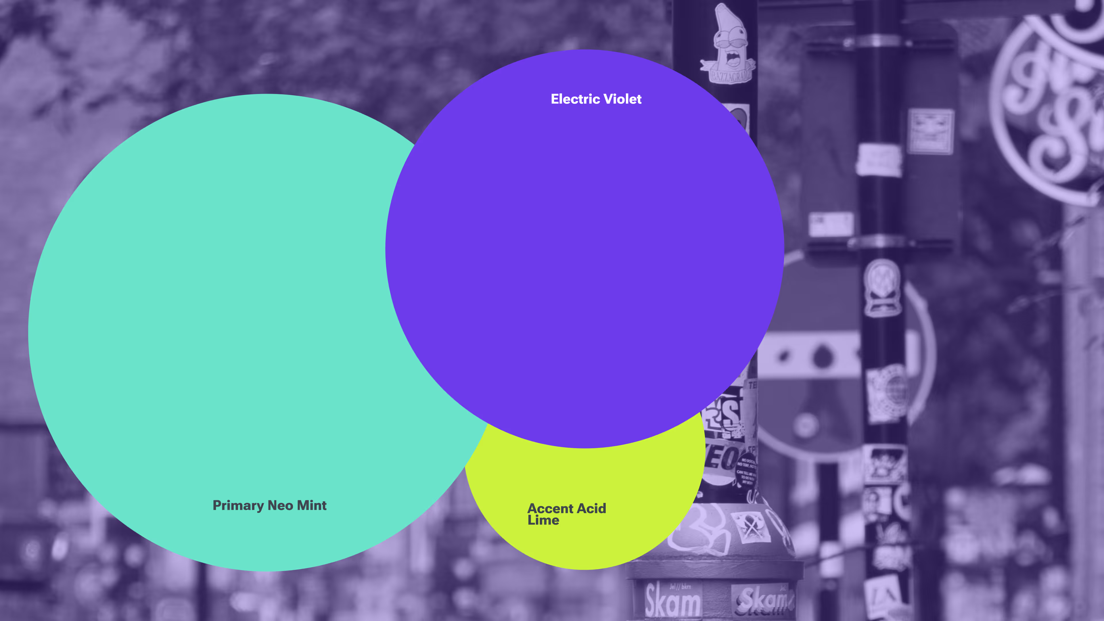
The whole language comes from early gaming, VHS nostalgia and the first years of the web, when digital still felt handmade. Silkscreen carries the display voice in small, deliberate doses; Roboto Flex does the quiet work in the interface and anywhere text has to be read rather than felt. Mint, lime and violet are an unexpected palette for the category, which is exactly why it is remembered.
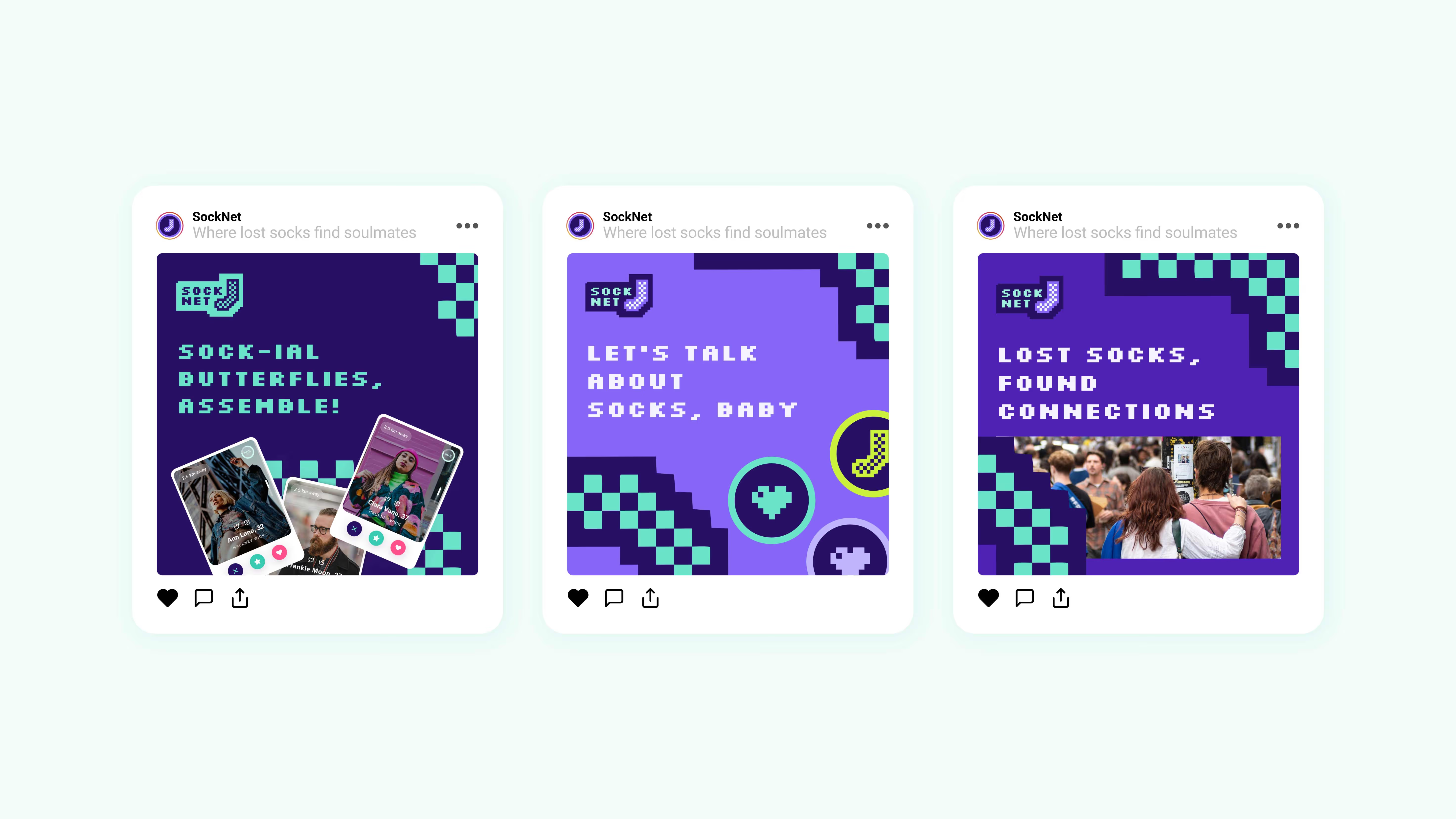
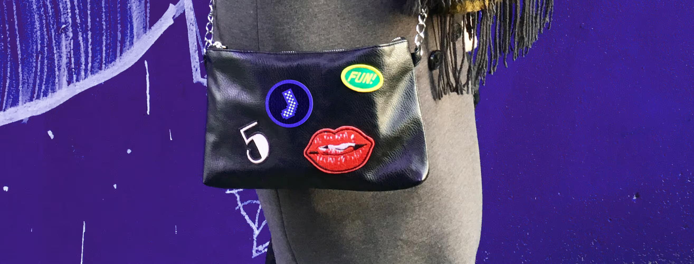

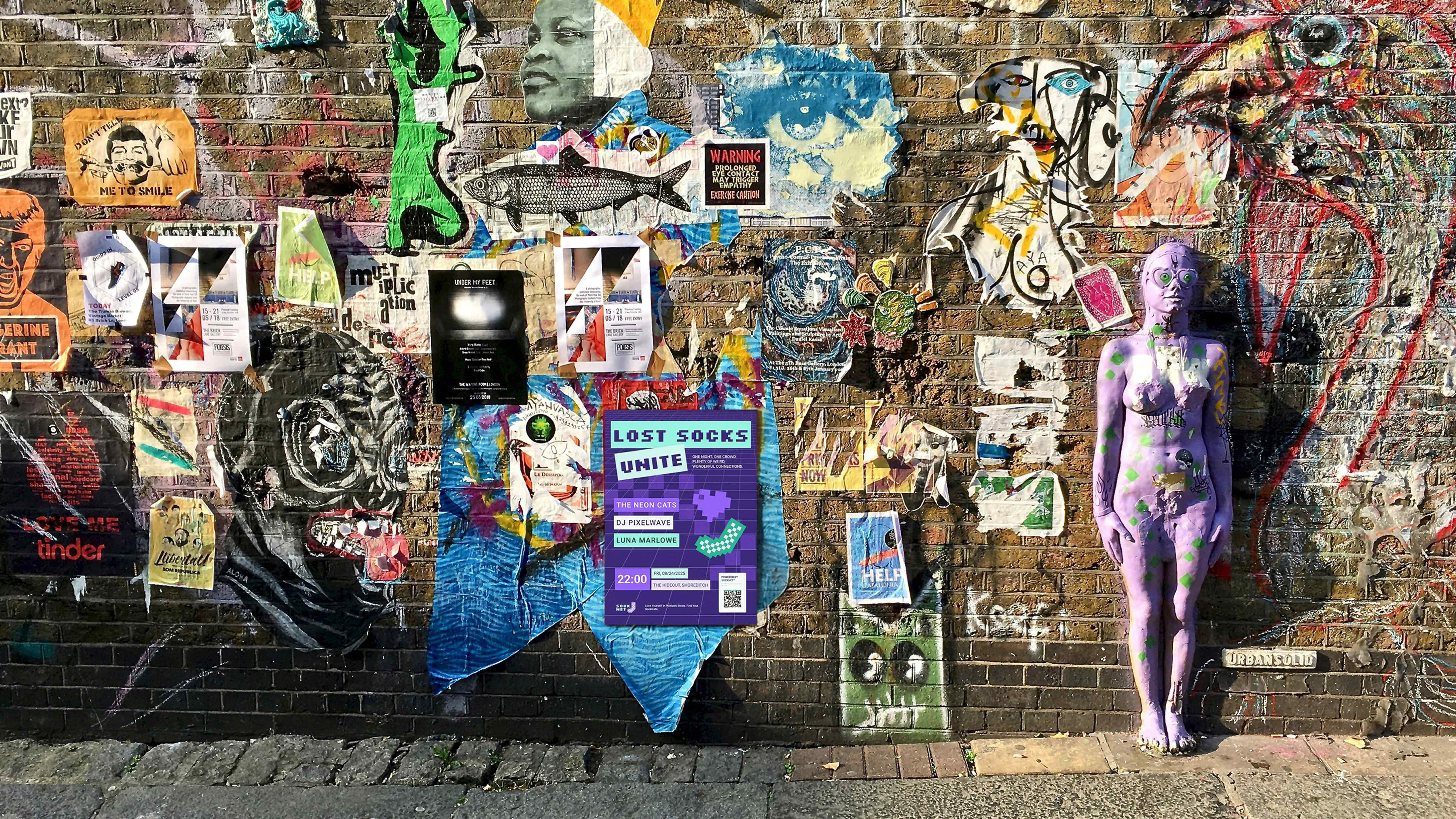
SockNet behaves less like an app and more like a club that is easy to join once you notice it. The socks and pins carry an NFC tag you scan in the app. Stickers and keychains appear in cafés, bars and galleries and unlock hidden profiles. Members meet at SockNet-only events. Pixel messages are left on city walls and in bookshops, found later through AR.
Every one of those is a design surface, and every one of them had to carry the brand at a glance, at a distance, in bad light, on fabric. That is what the system was built to survive.
SockNet is really about being seen — about finding people who are recognisably themselves in a noisy category built on presenting well.
The design drives the experience. It is the reason someone stops, photographs a sticker on a wall and looks the thing up.